Past Personal Branding
This was my first shot at branding myself, way back in 2015. It was my first time creating a logo for myself, first time building a website, and first time creating a resume. Ah, my humble beginnings.
Identity
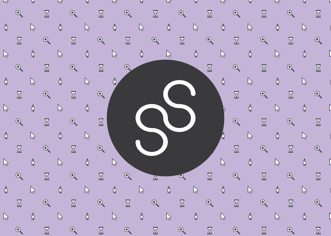
My brand identity had to represent my strengths as a designer. It had to showcase my design style- clean, simple, and effective, with some fun thrown in for good measure.
The pixel style design tool pattern came first. I struggled with which color to use in the background, but settled on this lilac color. It gave the pattern a bit of playfulness.
My logo was a simple combination of my initials, inside of a circle. It sort of looks like the top of a cupcake with vanilla icing, doesn't it? Maybe it's just time for lunch.
As for my brand font, I used my favorite at the time, Roboto. It felt versatile and fit nicely with the style I was going for.

Portfolio Website
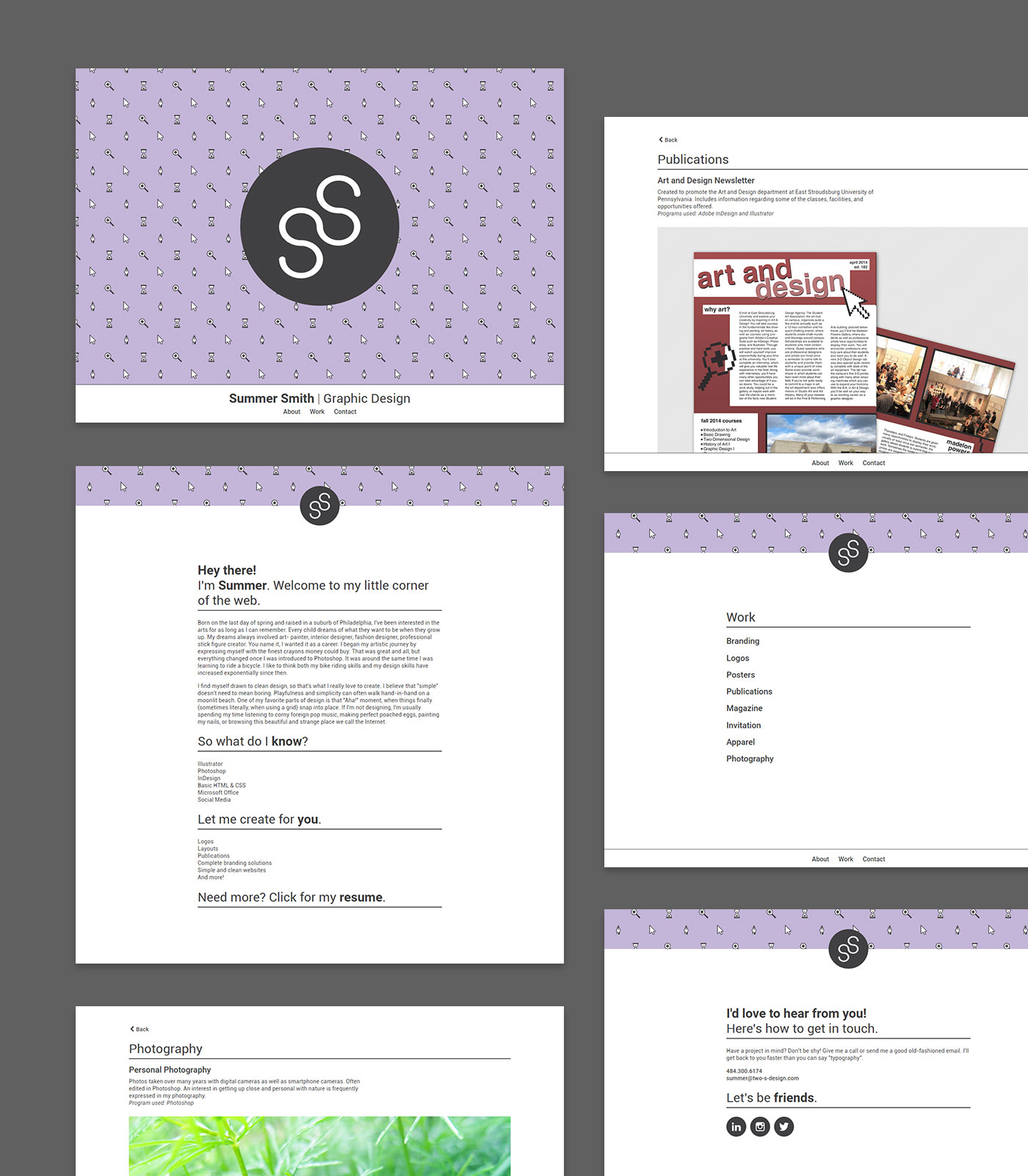
I had always wanted to learn how to build websites, so it felt natural that I should try to figure it out for my portfolio website. I taught myself the basics of HTML & CSS, and soon enough I had a mobile responsive site to showcase my work. It even had a fixed footer for navigation! Webfonts! SVGs! This site was my crowning achievement.
It was one of the most challenging projects I had taken on up to that point, but it was worth it. It became transformative for me. By designing and building my first site, I realized that I wanted to seek a more web-focused career, instead of the print-based one I was considering.

Resume
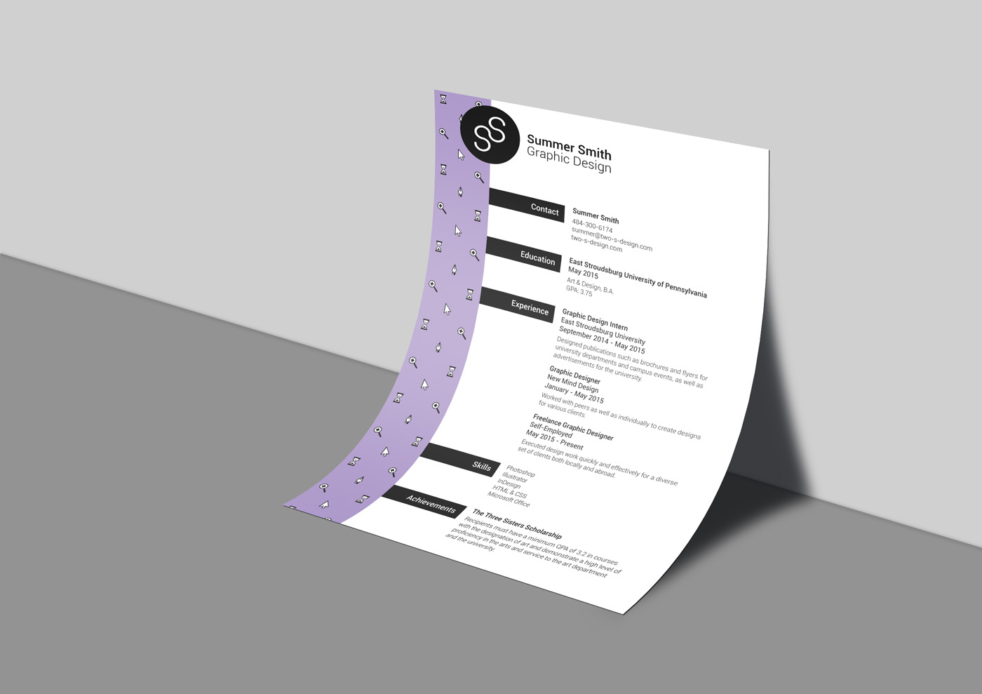
I carried my brand style through to my resume as well, with the pixel-style tool pattern on the side. I made sure to establish a clear type hierarchy and to be consistent with spacing, since both are crucial to my design style. This ol' resume strongly reflects my design ideals to this day.
