MyBudgetCoach
MyBudgetCoach is a financial coaching platform that helps low- and moderate-income families improve their financial health. Coaches use MyBC to deliver financial education during sessions, and clients can access a suite of tools, tracking their financial wellness between sessions.
Tool Redesign
In an effort to modernize the look and feel of MyBC, our team was told to start with the three tools used by clients and coaches to track each client's financial wellness- MyExpenses, MyGoals, and MyBudget. During the intro sessions, coaches teach the clients how to use each tool, and encourage them to get in the habit of using them on their own.
It was important that the new design was mobile-friendly, so that clients could do things like add expenses, track goals, and view their budgets on the go. We designed for smaller screens first, letting them be our base. Desktop versions came later, once we were sure the mobile view was good to go.
I used the MyBC brand guidelines, I stuck with the three main colors used in MyBC and assigned them to the three tools. MyExpenses would be gold, MyGoals would be blue, and MyBudget would be green.
MyExpenses
MyExpenses, the MyBC expense tracker, had previously been table based and not responsive. This made it particularly hard (if not borderline impossible) for users to enter their expenses on the go.
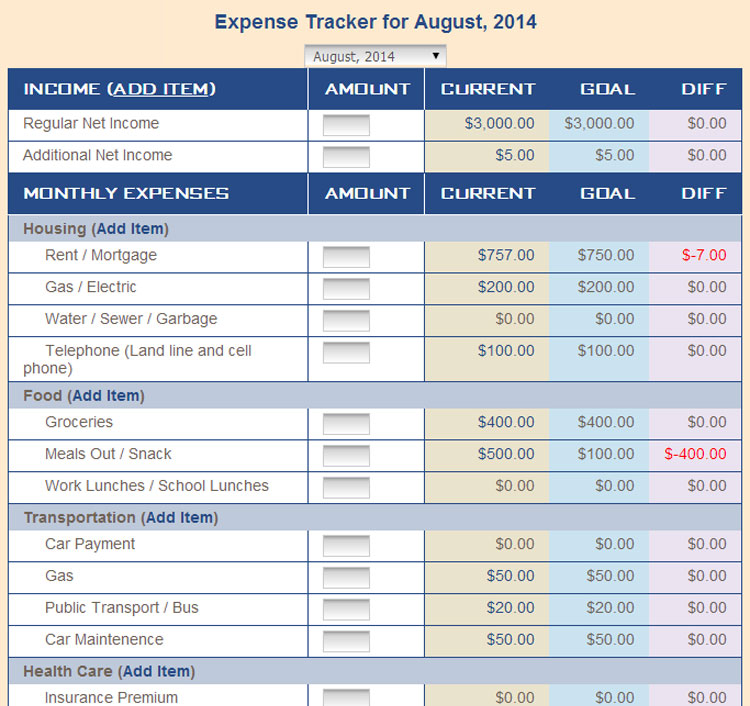
MyExpenses: Before
We imagined scenarios that clients might find themselves in where they'd want to input their income and expenses without logging into a computer. Perhaps after a grocery trip, a client could enter their total into MyExpenses while on a bus. Maybe a client could open a paycheck and input their income amount quickly before rushing off to pick up their kids from school. We needed to make this easier for them.
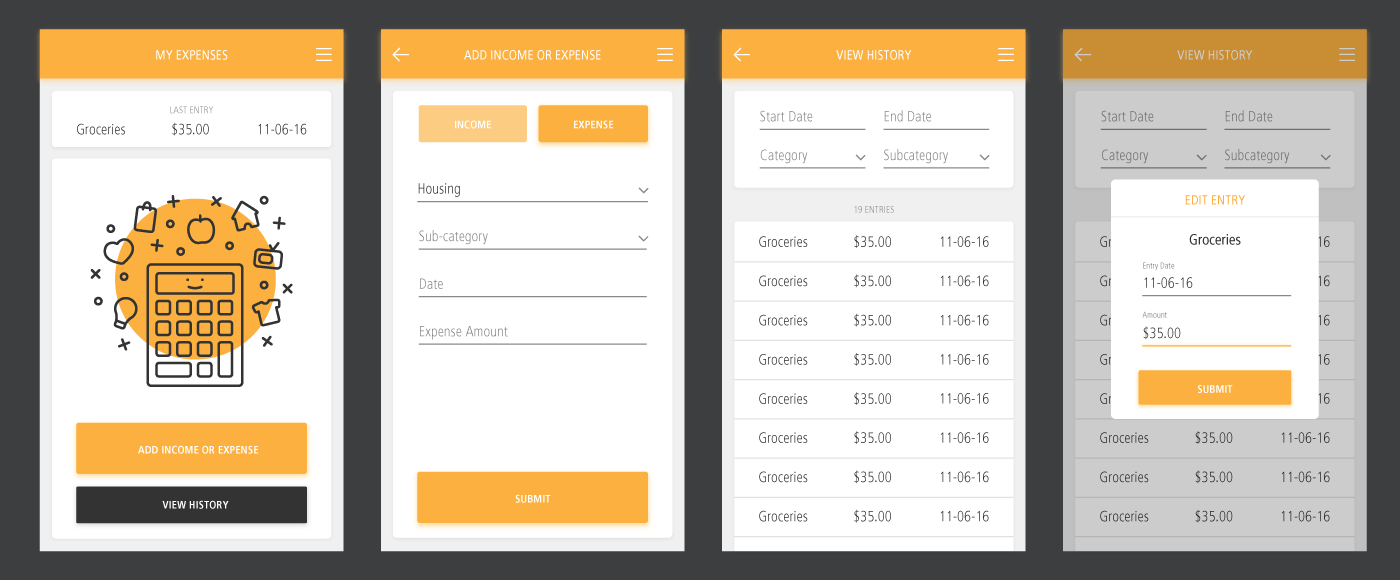
Adding and editing expenses
MyExpenses had the most simple of the three tool concepts, so we began here, where users meet Cal, MyBC's new mascot. I created him so that he could appear in a few places in the new tools, but he made his debut right here in the MyExpenses tool.
Cal greets users on the home screen of MyExpenses, where they can see the last entry they added (and edit it by tapping on it), view a history of their entries (and edit those by tapping on them), or enter new ones. These entries are fed into the MyBudget and MyGoals tools.
To enter an entry the user chooses whether it's an income or expense entry, and then completes the form before submitting. When they submit an entry, they're taken back to the MyExpenses home screen where the "last entry" section serves as a confirmation that their entry was recorded.
When viewing the entry history, users can sort their entries by a few parameters. If they want to edit an entry, they select it from the list and can change the date or amount.
Want a closer look at MyExpenses? Click below to see the completed mockups.
View MockupsMyGoals
A huge part of financial wellness is creating and tracking goals, and that's exactly what the MyGoals tool aimed to help users do. Users could add a new goal, and track each goal to completion.
There were two types of goals, financial and non-financial. Financial goals were goals that users would periodically put money towards, such as savings goals or paying off debt. Non-financial goals were goals that were tracked using actionable steps. For example, if a user's goal was to open a savings account, one of their action steps may be "research banks" or "contact bank of choice".
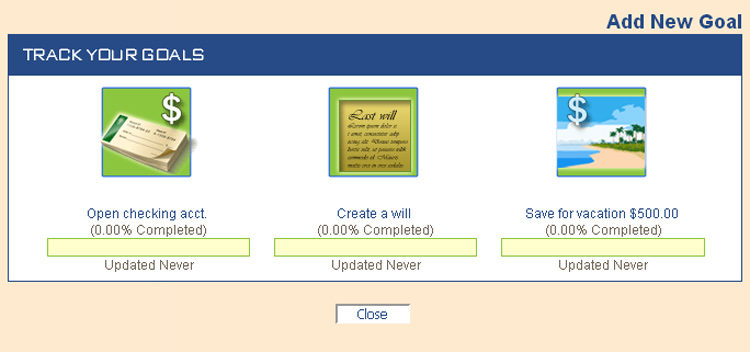
MyGoals icons: Before
MyGoals icons: After
In total, there were 25 possible goals to chose from, including an "other" option for both financial and non-financial goals. Part of my goal for MyGoals (ha) was to make a brand-new icon set. They now better reflect the MyBC brand and look right at home in the updated MyGoals design.
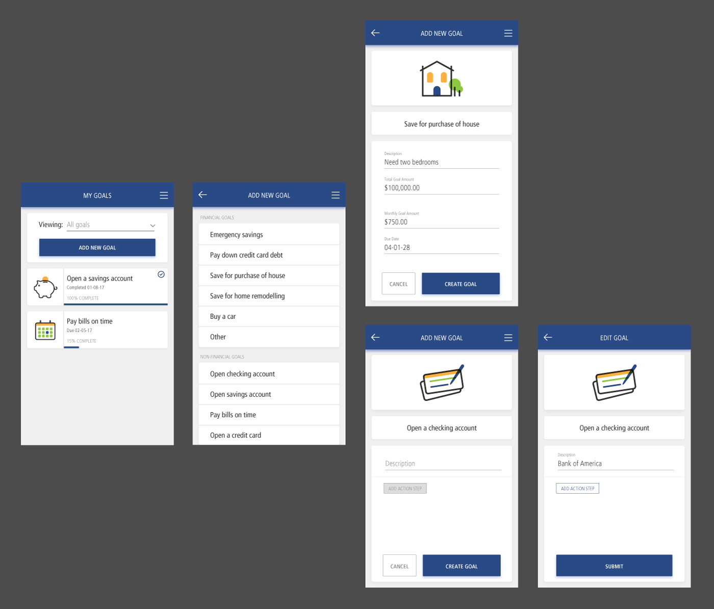
Adding a new goal- financial vs. non-financial
On the MyGoals homescreen, users can see an overview of their goal progress, as well as add new goals.
In order to create a new goal, the user selects the goal they want to pursue. If it's a financial goal, they input the goal description and amount. The description is especially crucial for "other" goals, which a user could easily have multiples of. After entering a description and goal amount, they then either input how much they can save each month, or chose a date they want to see the goal completed by. When they input one of those two values, the other will autofill. If they select a non-financial goal, they add a description, and tap "create goal" to activate the "add action step" button.
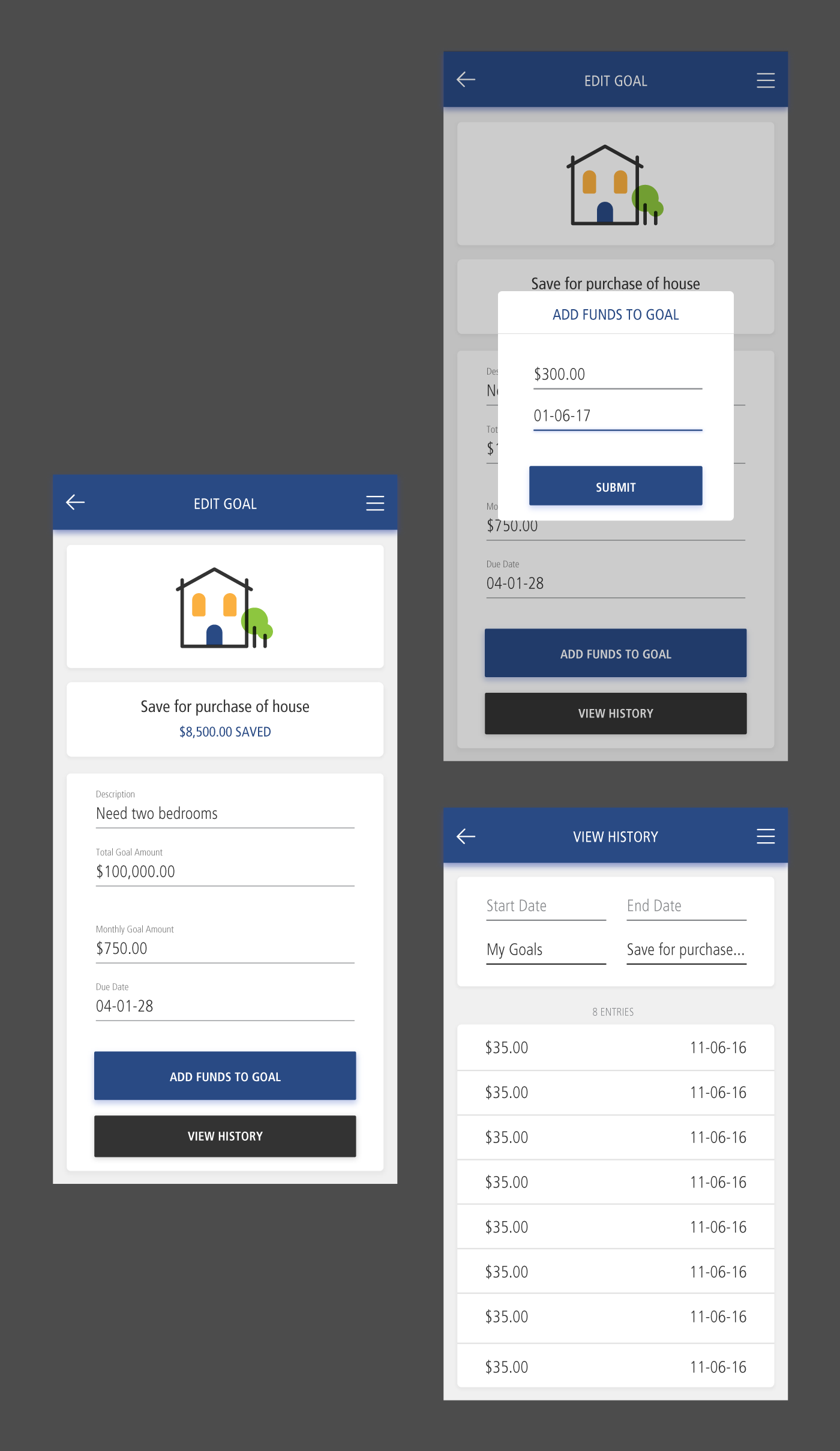
Editing a financial goal
To edit or view any goal, the user selects it on the MyGoals home screen.
For financial goals, users can edit the goal amount or due date. They can also add funds to the goal or view the entry history for the goal, both of which feed directly into the MyExpenses tool. The MyGoals "view history" page is essentially just a blue-skinned version of the MyExpenses entry history page. The category and sub-category prefill in the filter to represent the current goal selected.
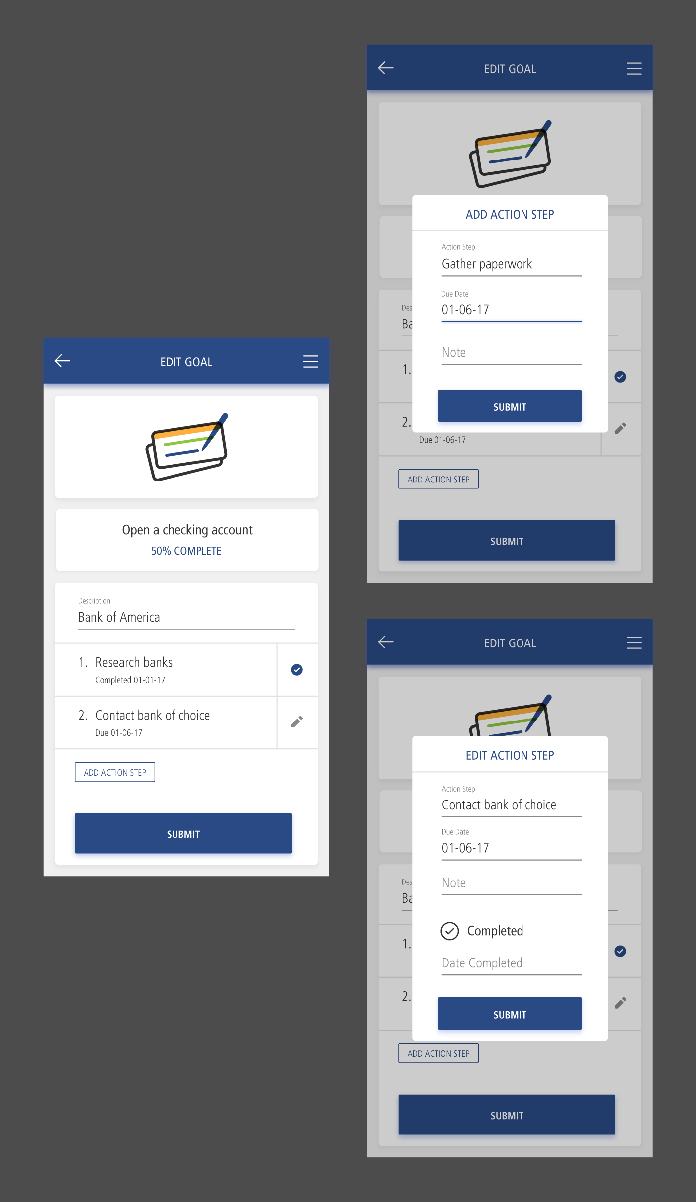
Editing a non-financial goal
For non-financial goals, users can edit or add action steps. Once marked as complete, the action step displays a small check mark instead of the pencil.
Want a closer look at MyGoals? Click below to see the completed mockups.
View MockupsMyBudget
MyBudget is the MyBC tool dedicated to helping users keep track of their budget. It was mostly a view-only tool, with all data being pulled from MyExpenses. It was the big picture view of a user's finances month-to-month.
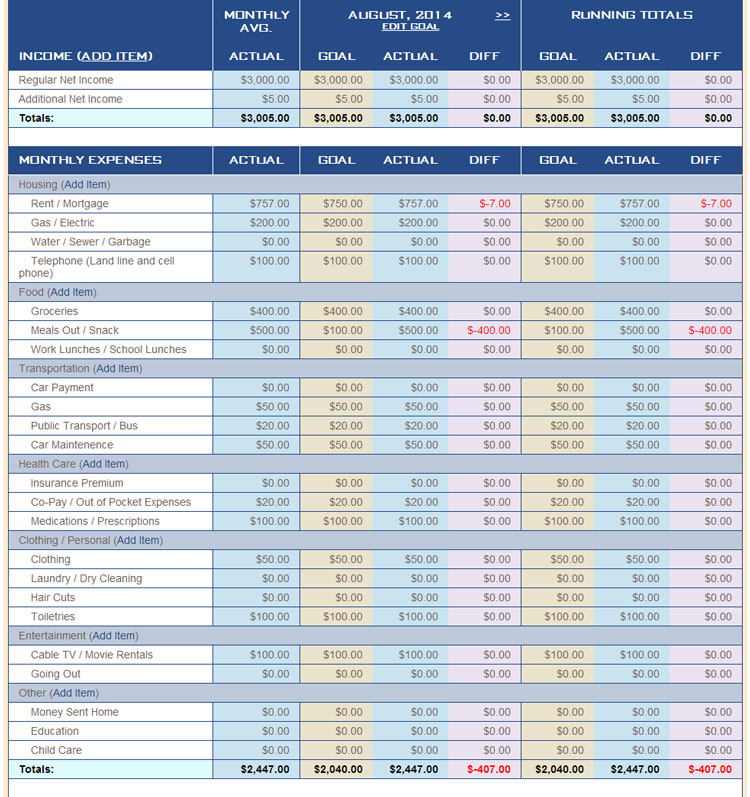
MyBudget: Before
The information was displayed in a massive, mobile-unfriendly table. The big challenge was getting all of this data into a format that users on any screen size could access and understand quickly.
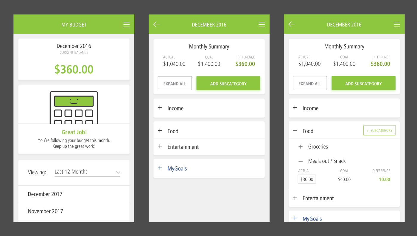
Viewing a monthly budget with MyBudget
Cal greets users again on the MyBudget home screen. Depending on how the user is doing so far that month, Cal's emotion may change. There is a happy Cal (shown above) for when users are doing well, an indifferent Cal when there's room for improvement, and sad Cal when things just aren't going so great.
The user gets an idea of how they're doing at a glance with the "current balance" (how far over or under budget a user is) along with Cal's emotion and message. For a more in depth view, users select a month, and then can see each budget line in an expandable list, along with a monthly summary.
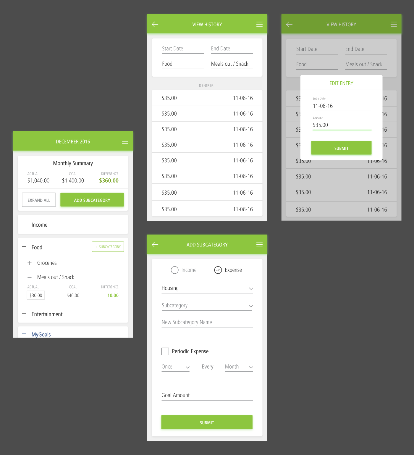
Viewing the entry history and adding new subcategories to the budget
When viewing the monthly budget page, a user can expand a category and subcategory to get down to the nitty-gritty.
Once a subcategory is expanded, users can see exactly how their entries from MyExpenses are affecting their budget. They'll see whether they're over or under their goal for the month, and they can click on the "actual" amount in order to access the entry history.
Users can also add subcategories, which will unlock them in MyExpenses and allow users to submit entries towards them.
Want a closer look at MyBudget? Click below to see the completed mockups.
View Mockups