Personal Projects: UI
Sometimes I want to try ideas and techniques that I won't get a chance to implement on any current projects. That's where personal projects come in!
Daily UI Design Challenge
I decided to finally hop on the bandwagon and begin a daily UI design challenge. Each weekday, a short prompt is emailed to me, and I create a UI element or mockup. The challenge isn't perfect; you're not provided any information beyond which element you're to create. You don't get information about your users, brand, platform, or anything else that would be helpful to UX designers.
It can feel a little superficial, but I thought this would be a good way to try out new design tools, techniques, and styles I otherwise might not have been able to. I'll share my favorites here!
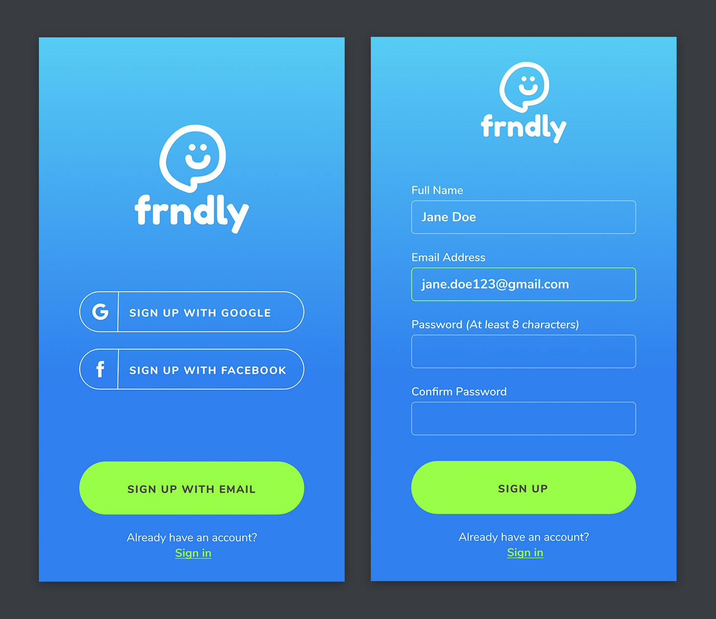
Day 001 - Sign Up
I created this logo the very first time I opened up Figma, and dug it out to use it for this chat app concept. Users would have 3 options when creating an account. If they don't want to connect a social media account, they could sign up with email.
I included a password creation hint so that users wouldn't get frustrated typing in their ideal password only to be told that it's not long enough. It's better to be up front with users!
Day 002 - Checkout
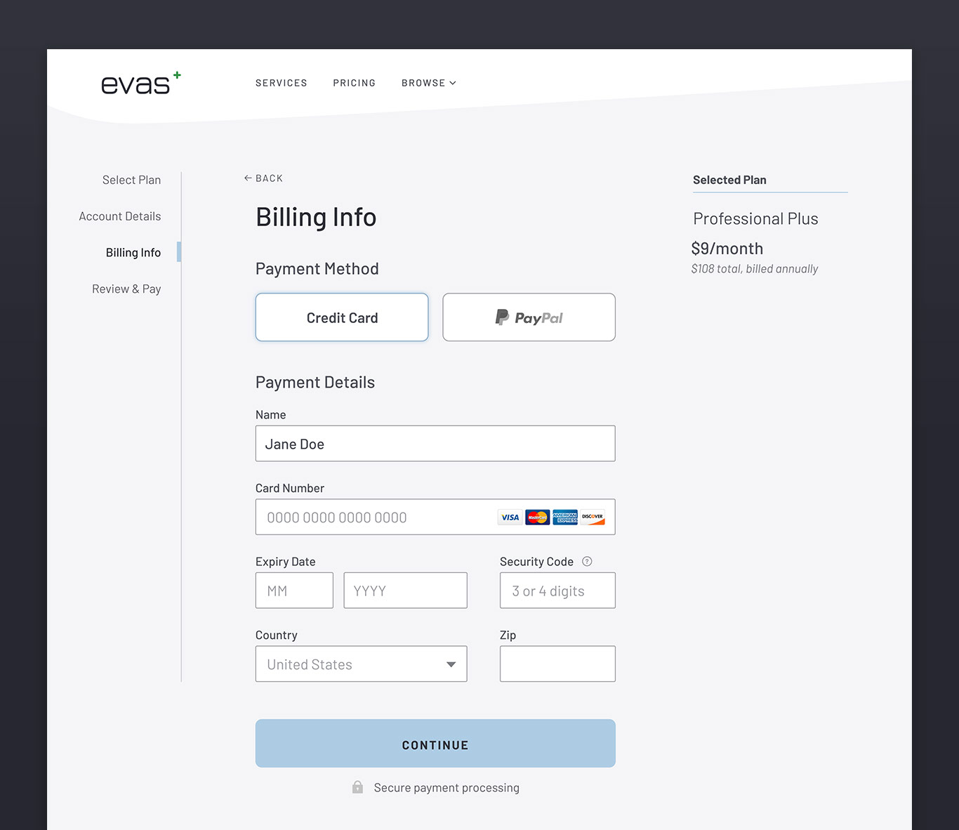
The prompt for day 2 was simply "credit card checkout". I decided to envision a subscription based online service aimed at professionals. After researching other subscription based online services and how they handle the checkout process, I created the checkout page for a fictional company.
Day 003 - Landing Page
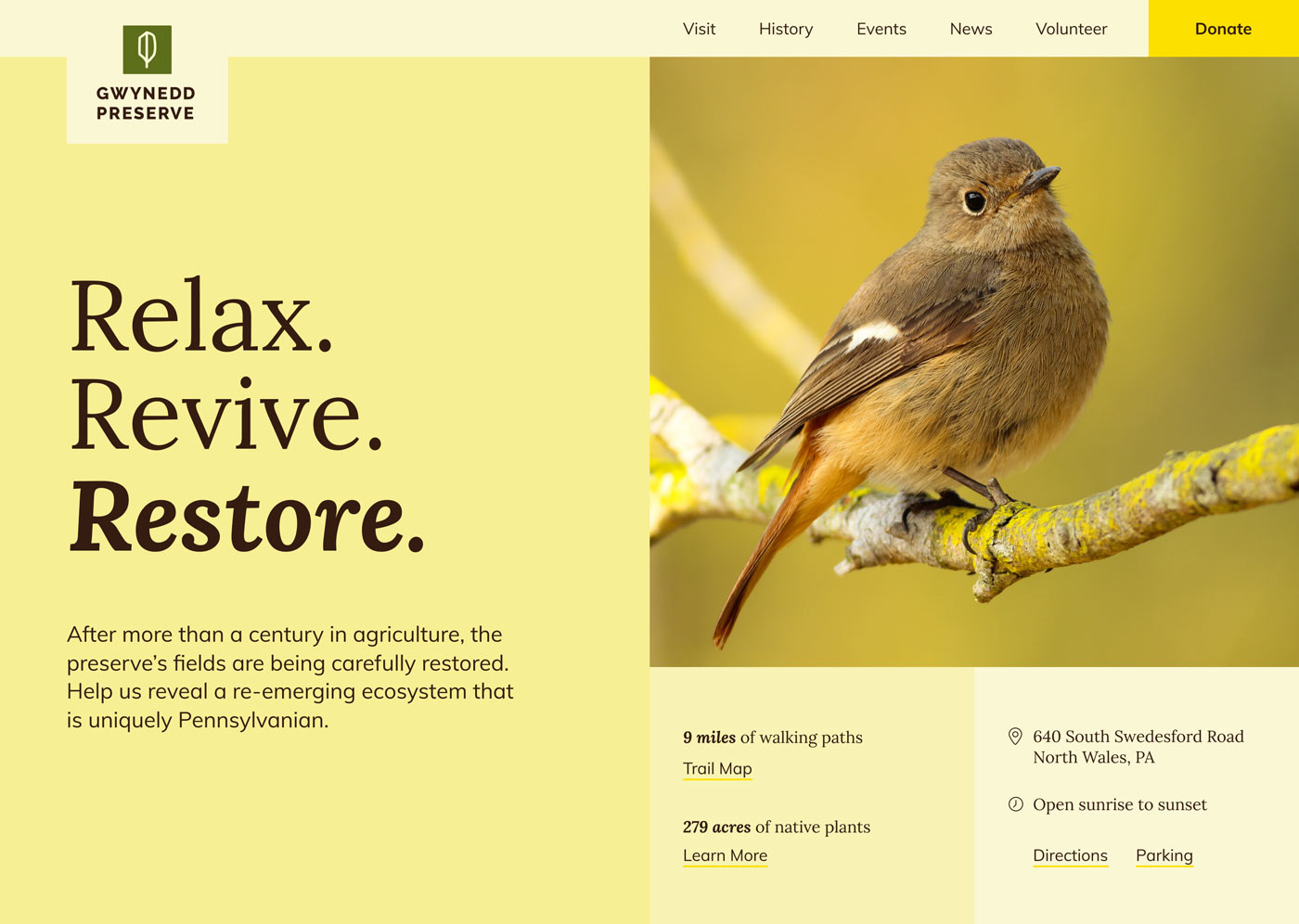
Day 3's prompt was "landing page (above the fold). I created a landing page for a local nature preserve after researching the sites of other nature preserves. Most emphasize a "donate" link, and have photos of wildlife found at the preserve.
Day 007 - Settings
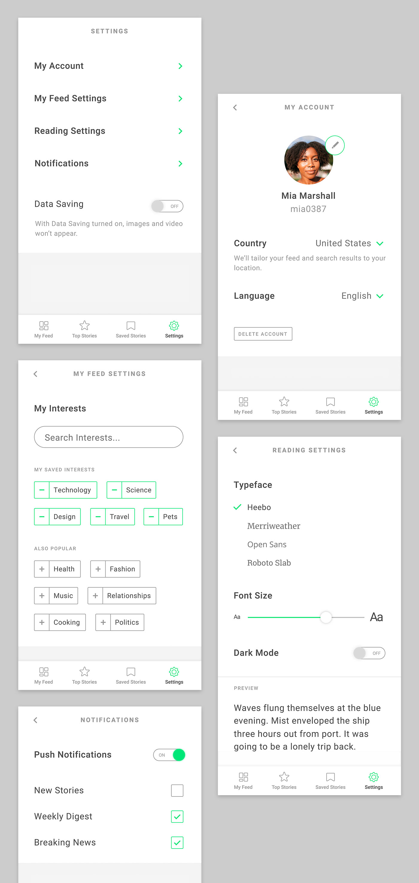
On day 7, I created a settings section for a personalized news app. I added a "data saving" option for users who are saving data or want a streamlined reading experience, as well as font options so users could personalize the app to fit their needs.
Day 008 - 404 Page
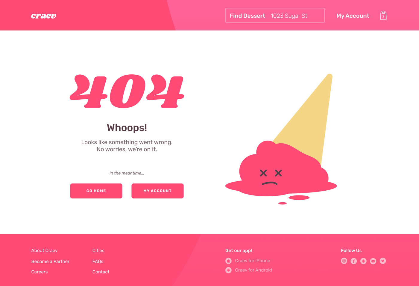
After the toned down color palette of day 7, I was craving some brights. I created this 404 page for a dessert delivery site concept.
Day 009 - Music Player
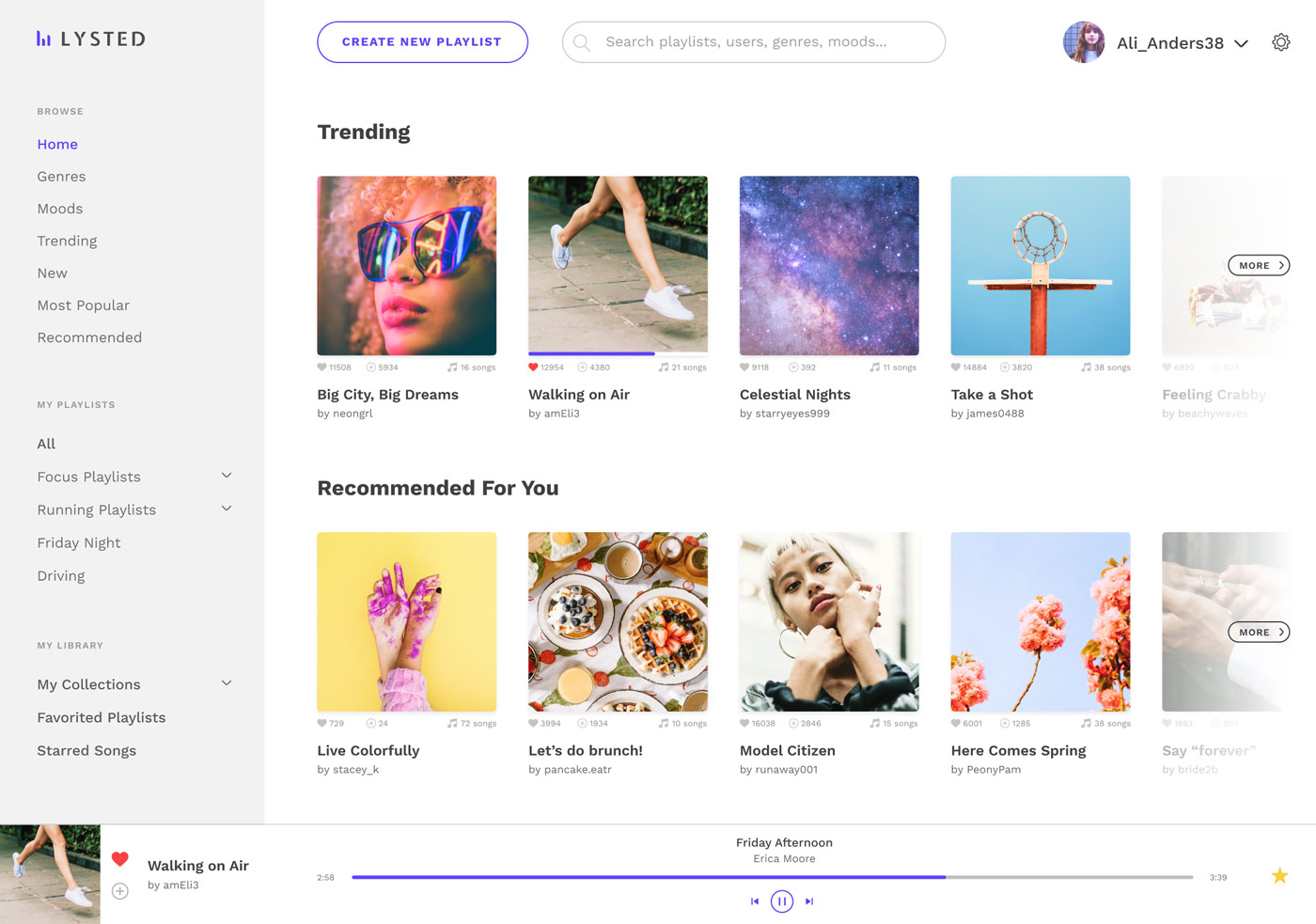
I designed the desktop app for a playlist-focused music service. Users would be able to listen to playlists created by others, as well as curate their own playlists and playlist collections.
Day 010 - Social Share
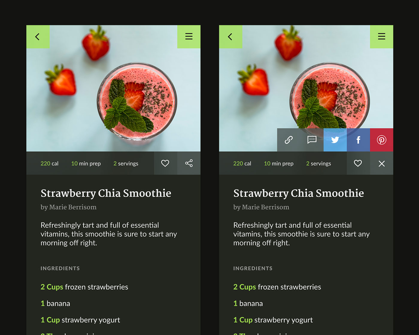
For day 10, I created a simple share feature for a recipe app. Once the share button was tapped, it would expand and allow users to pick the social network of their choosing. Clicking the "x" would collapse the social share row.
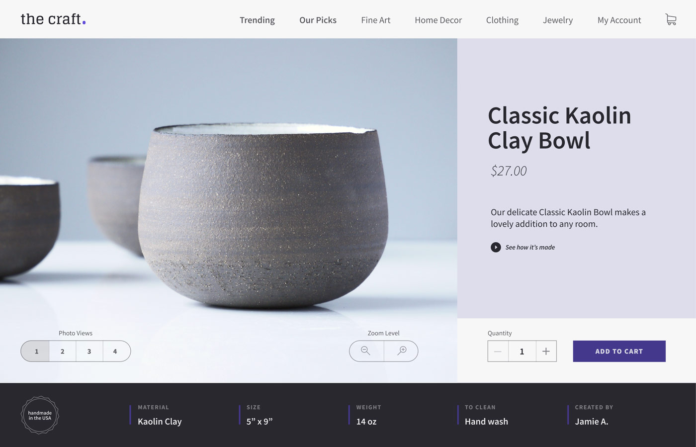
Day 012 - E-commerce Shop
I created a homemade goods e-commerce site concept for day 12. To emphasize the handcrafted element of each item sold on the site, I added an option to watch the product being made, and noted who created the product. I also added a small badge indicating that the product was handmade.
